I swear, I wait for Pantone to release their seasonal colors as if it meant I’m getting an entire wardrobe each time or something. I’m just a color addict and love to see what the “in” colors are supposed to be each season.
This time there are some gorgeous hues among the chosen ten:

Take the first two of each row and it’s pretty much what I’m trying to throw at my house in the hopes some of it will stick 😀
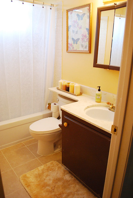
We have been adding a lot of dark chocolate brown (or coffee brown, I guess, since it’s named French Roast) around the house. Less harsh than black and warmer, we painted the new mantel my husband built and repainted our bathroom cabinets in a similar shade.

I say similar because it’s obviously not the same, and according to my husband, I am a tetrachromat – what? I’ve never been called such a thing in my life!!! WTF??? Oh. It means I can see way more colors than other people. I don’t know if it’s necessarily true but he said it after I showed him 8 paint chips so he could choose one for our living room and he said they all looked the same to him. “What?” I said, “this one’s pinker, and that one’s warmer, and that greenish one, I don’t like that one . . . ” — ergo, tetrachromat.
But as usual, I digress.
The next color, Honey Gold, is so close (again, tetrachromat) to the wall color in our bathroom. My husband calls it orange – hello! – but to me it’s a warm, glowy golden yellow.
Pink Flambe, I swear, is one of the few pinks I can wear. I have olive skin with yellow/green undertones and pastel or soft pinks are not a good thing on me. I was actually eyeing this bracelet from the awesome Jen Ramos as a birthday (I’m 41, yay! boo!) present but I chose a different color. The bracelet is a little bluer than Pink Flambe (tetrachromat!) but close enough.
Tangerine Tango is the color of 2012 — this fall I am sprinkling throughout the house a few glitter take out cartons in a similar shade of orange. I found them in the dollar bins at Target – score!
Ultramarine Green is, sadly, a color I absolutely cannot wear. It’s too blue and makes my skin look gray. Boo.
Bright Chartreuse is one of my new best friends. I LOVE this bright yellowy green! I found these chess-themed candlesticks also at the dollar bins at Target, they were’ $2.50 each.

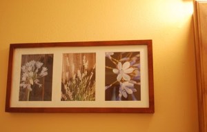
Olympian Blue is a little darker shade of my beloved turquoise but I like it nonetheless, it is close to the ribbon trim on my glammed up poster frame:

The last three colors, Titanium, Rhapsody, and Rose Smoke, pretty much have no room in my life 😀 I am not a grey girl, I like my purples darker and redder, and don’t like pinky beiges. Yeah, the love ended right before those three.
So there you have it, my run down of the latest and greatest from Pantone – which colors do you like?

Oh I love the ultramarine green and it is a color I look good in. Orange and yellow look horrible on me. Love how you have used it in your home.