Fashion Friday: Favorite Outfit

I’m not a big fan of sweaters — cardigans are one thing but closed sweaters make me claustrophobic. This one, though, is so comfy and the neckline is not so tight so there’s no problem.

bronzy

I love the richness of winter colors, browns and bronzes, olive greens and ambers, and my favorite of all colors, burgundy. Not in this outfit, but then it would be my lipstick ;D

Have a wonderful weekend!

Fashion Friday: Missoni for Target

So the much-awaited line of Missoni for Target finally arrived in stores an d online, crashing the website and causing much chaos for those of us who usually shop at Tarjay, Missoni or no Missoni.

I admit I was awaiting this line as well, but as with most designer lines that are self-knocked off for budget stores, most of it failed to wow me.

Part of it is that so much of the line is swimwear. Granted, someone who knows her Missoni might be shopping for spending cold winter days in Barbados or cruises, but even so the horizontal stripes are kind of weird. A few other items were vests or blouses that weren’t really flattering, the vomitorium of colors and patterns too loud for me.

thumbs down missoni

Where this line fared better was in accessories and home goods items: Shoes, scarves, decorative items, etc. are bright pops of color in doses that are totally doable.

thumbs up Missoni

Of course, these are the items are that mostly sold out, so I may not be the only one who thinks the bigger pieces would have been more successful in a more muter palette.

Of the items I liked I may get the beanie and/or the scarf, but I’ll have to see them in the store before I make my decision.

Have a wonderful weekend!

Featured at Beneath my Heart

Holy painted tables, Batman! The wonderful Traci from Beneath My Heart featured my little green table as one of the best DIY in July projects! Yayness!

0730table9

You really couldn’t find a sweeter lady than Traci out there in blogland, and she’s crazy talented, too, so I am very psyched to have been featured on her blog.

I got a new project my husband and I (and my oldest) worked on these past few days, so I’ll tell you all about it soon – have a great Tuesday!

My house colors

We’re in the middle of a little living room project:

0813livingroom

and I had to look up my living room wall color. I did a post about my house paint colors in my last blog so I thought it better to list them here for future reference.


Our master bedroom has a sponge-finish treatment on the wall combining the 2 shades of tan. The wall where the lovely mirrored closet doors got the dark burgundy but lord knows I regret that decision. My plan is to do away with the closet doors completely and paint the wall to match the rest of the bedroom.


Our living room has a similar warm palette but instead of the burgundy we’ve added a dark chocolate brown accent color in the form of our new IKEA TV console and the project we are currently working on, which will be painted to match the console.


My little man’s room has two shades of light blue, and we seriously need to upgrade his bedroom soon. Aside from a few Mickey-themed items, there’s nothing else there and he outgrew Mickey a couple of years ago.


My kitchen/dining room colors are super warm and cozy, I talked about the changes we made 8 years ago in this post.

My bathroom got a cheerful coat of bright, warm yellow paint, which I continue to love, and it’s going to get remodeled in the next couple of months (fingers crossed) – I’m debating tile choices.


The paint color is Ralph Lauren’s Chamois. The cabinets were painted dark brown, echoing the living room console.

I will be updating the progress on our living room project in a few days!

Gallery wall

First, a happy birthday to my mommy today!

Recently my husband had the idea of framing some of the many (believe me when I say many) pictures we have taken. He wanted a large-scale gallery wall, with 18×18 photos surrounding our TV.0520grid

We had recently purchased a new console for all the TV components and really liked the look, but wanted some more color = photos!0520grid1
We had the photos enlarged and printed at FedEx Office and then we trimmed them down to size and matted them on laminated backerboard.

We used large velcro dots to mount them on the wall so we can easily switch them out when needed. I chose some of my favorites – 0520grid2
On the right side there are two pics of our youngest, with me in all his bald-headed glory, and below in what we call his “Blue Steel” pose.

On the left is my oldest – the top photo is his first time at the beach with daddy, and below is a fairly recent shot that I just adore.
0520grid3
It was really tough to choose just a few shots of my boys, there are so many that I love!

The top center shots were taken during our first (and so far, only) cruise last year.0520grid4The left is the shore in San Juan, Puerto Rico, and the right is one of the islands we visited. Lovely memories.

Our plan is to print out new pics for fall/winter and swap them out as we like. I love seeing my favorite faces every day – not just in real life, but also up on my wall 😀


The Girl CreativeTodays Creative Bloghandmade projectsSomewhat SimpleIt's a KeeperWeekend Bloggy ReadingJoin us Saturdays at tatertotsandjello.com for the weekend wrap up party!

Pop of color

I don’t love the color on my house’s exterior. It’s a medium gray. With black trim. And an orange roof. We’ve lived here for 7 years, so sometime in the next 5 years we will probably paint the exterior.
I’d prefer a warmer gray, something like one of these:
In the meantime, I believe in being as happy as I can with my surroundings, as they are, so I decided to brighten up the front door. Please don’t mention the hideous mailbox and light fixture. They are evil. They are brassy. They will be destroyed, er, repainted.

I got an urn at a garage sale a couple of years ago and never really found a good place for it inside the house, what with kids and cats and dinosaurs all over the place. But I wondered if it could find a home right outside our door.

The color was very blah, though, so I decided to paint it a happy, sunny yellow:And I love it!!! The color is Bauhaus Gold by Krylon, it is a rich and saturated golden yellow, and I love both the contrast between the warm yellow and the gray and black, and the fact that it pops against the wood door.

That’s how our front door is looking these days, bright and cheerful and ready for summer!

My new little office

Ever since my youngest was born and his room went from office to nursery, my husband and I have had our office space in the playroom.

It gets messy. Dinosaurs go everywhere, and seem to have a fondness for being on my desk and under my chair, so that more than once I have nearly toppled backwards because one of the wheels got caught on an ankylosaurus. Furthermore, my desk was so massive that I couldn’t reach all the way to the back of the desk and things that got put there were, inevitably, forgotten.

Knowing well that “the bigger the purse, the more you stuff in it”, I decided to get a smaller desk. I ended up with an IKEA desk, and I LOVE it. It is small but with all the space i need, and it is a lot more manageable for my needs.

Since I had some extra space, I appropriated a white shelf tower from my youngest’s room. No more diapers and wipes for him, so it became mine, all mine!!! But I decided to pretty it up with some peacock paper I saw at my favorite paper store, Paper Source.
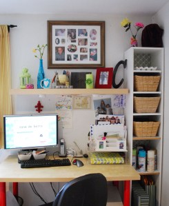
As much as I would like my office to look like something out of Martha Stewart or Real Simple or something, it is simply not my style.

I love color. The more the better. Up on the shelf above my desk I have turquoise, green, hot pink, red, brown, etc. There is a mini album my husband made for me on my second Mother’s Day, it is from my oldest, telling me all the ways I have been a good mommy to him. I love it and read it all the time. My darling dad watches over me every day, I made a collage of pics of him and his sweet smiling face keeps me company.

I recently made a family binder with some tips from Simplify 101, and that rests on the right, underneath the paper station with current mail I need to address, etc. I also have a weakness for cute notebooks, so there are about 2 (or 7) back there.

On the tower itself, lovely IKEA baskets corral items, below is my spray paint shelf and finally a couple of paper boxes and a magazine file. The item on top is the egg crate from Anthropologie, it holds some of my everyday jewelry.

So that is my new office area, messy and colorful, like my life. I love it, aside from the fricking ankylosaurus that still plague me ;D

Weekend Bloggy Reading