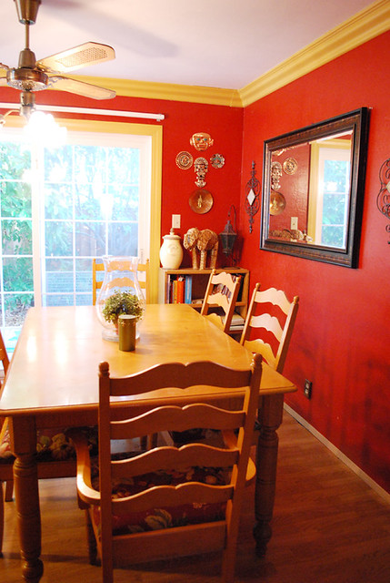
We loved our red walls.

Our red walls were so awesome.
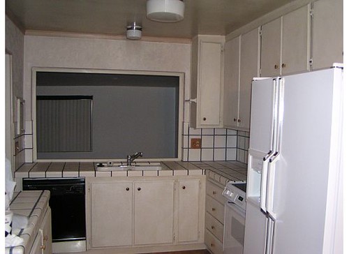
There was just one teensy little problem. A complete lack of light coming into the kitchen and dining rooms.
See where the pots are hanging?

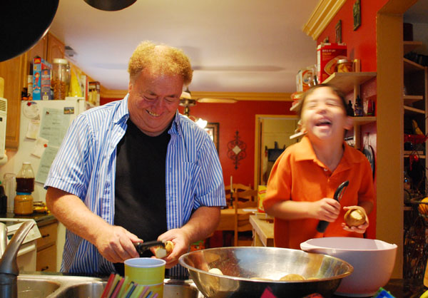
That’s where the big window used to be, looking out onto the backyard, with lots of natural light coming in. But a previous owner decided to add a room there – which is now the playroom/office. I know it looks like light is coming in to the kitchen, but the truth is, every single light has been turned on. The two kitchen lights, the dining room lights, the playroom lights, and I took the picture on a very sunny day (July of last year).
It didn’t help that the other source of natural light – the doors to the side yard, were shadowed by our pear and avocado trees, which we are NOT parting with.
Again, it looks bright and sunny here but every light was turned on.
Over the last few months we came to the realization that we could spend more years turning the lights on just to do dishes, because it really is that dark in the kitchen, or we could replace the red and help things along by installing some canned lighting.
We didn’t want to go back to the dreary off white that we found when we moved in:
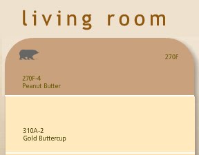
We love warm, cozy colors – so off we went in search of a color we liked. It turns out there were two.
This is Valspar’s Cafe, a warm, creamy shade.
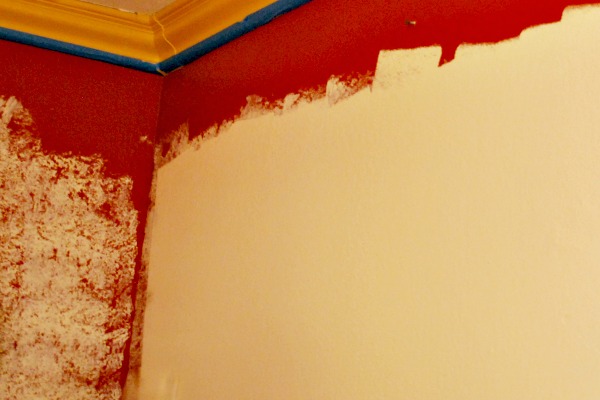
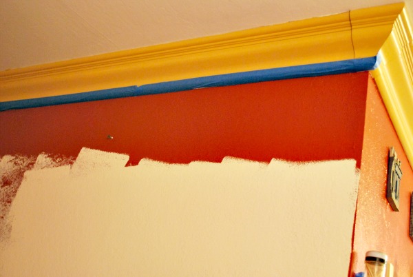
My husband wanted to try a sponging finish with a slightly darker color, so I chose Warm Buff, also by Valspar.


He did two walls so if we didn’t like the result, we could paint them over and start again. However, we both loved the finished look so we worked until late at night to get the painting done. We also made some minor changes and are still in the process of figuring out some final details, but we love the change. We went from this:
to this:
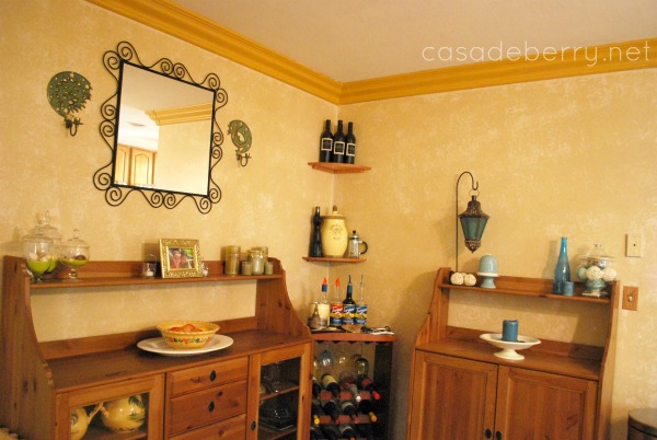
Some more views:
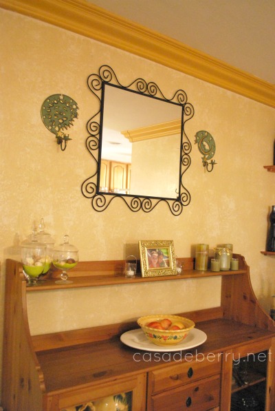
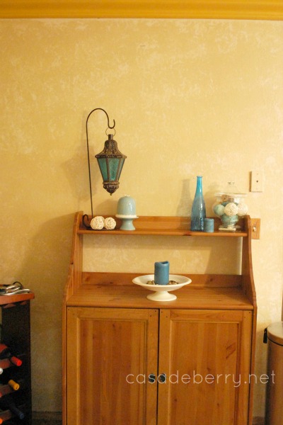
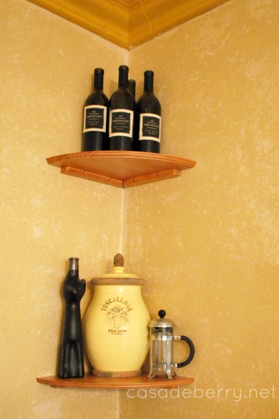
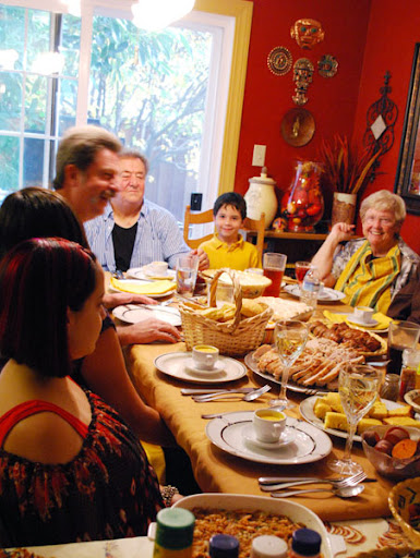
Already so much brighter and lighter, my dining room and kitchen no longer feel like such a cave! And I love that we can still have red accents around, but the neutral walls are open to so many colorways.
Now we are working on Canned lighting:


In fact, my husband is up in the attic as I type 😀
I hope your weekend is a wonderful one!