We’re not letting it mellow

When we moved into this house eight years ago, the living room was painted a dismal grayish-peach that made the space look small and drab. Wanting to lighten it up, I chose a buttery yellow for the walls. My husband Steve wanted a tan color for the trim so this is what we went with:

Both colors by Behr.

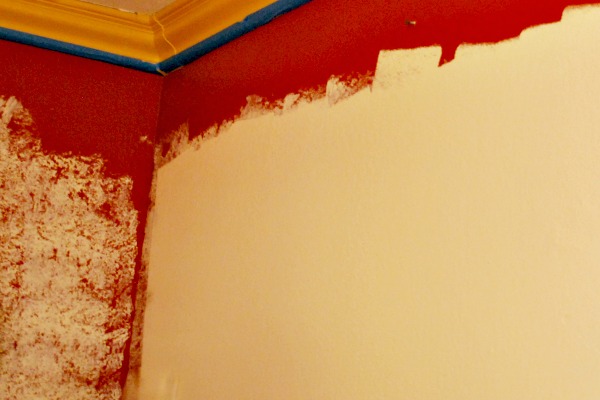
Eight years later, I’d had it with the yellow walls. So had my husband. We knew we wanted a warm neutral since those are the colors we gravitate to, our living room is filled with browns, creams, tans, reds, so to throw a grey or pure white wasn’t going to work. Steve picked Chamois Cloth by Behr, which looked lovely on the paint card, but it turned out to be pink. We don’t do pink. I do pink occasionally in my clothes, but pink walls are not us. Here are the painted and unpainted areas side by side after the Chamois Cloth snafu:

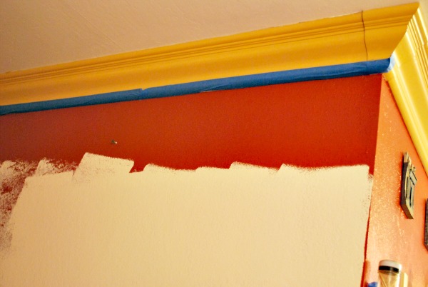
So it was my turn to get paint, and since it’s closer, I went to Lowe’s and got Valspar’s Cream in my Coffee:

Yes, that’s my youngest helping out, and you can see the difference between the yellow walls and the new color. Not a huge difference, just a subtle de-yellow-ing that left our walls looking brighter.

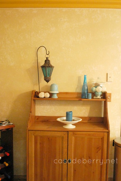
The color was a bit lighter than my husband had imagined, I think, he kept mentioning tans and that he wanted “color”, but he ended up liking it because a) our house is so dark that we need all the brightening up we can, and b) because it made for a peaceful, serene backdrop and accents in bright colors could then shine.

Speaking of our youngest, Alex, I have to say that one of the things I love the most about Steve is that he encourages the kids to jump in and help with whatever we’re doing, as long as it’s safe for them. Alex asked if he could help so out came a little roller he could handle and after covering up the floor, off he went to roll paint on the wall to his heart’s content.

Alex kept saying how happy he was to help — it was such a big deal for him to work alongside mommy and daddy! It was a big deal for us, too 😀

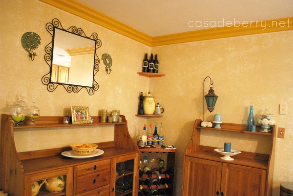
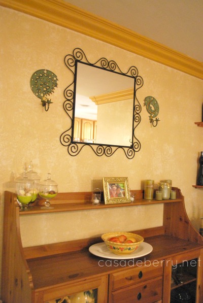
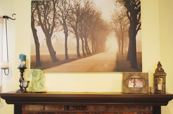
Another shot of the new color on the walls:

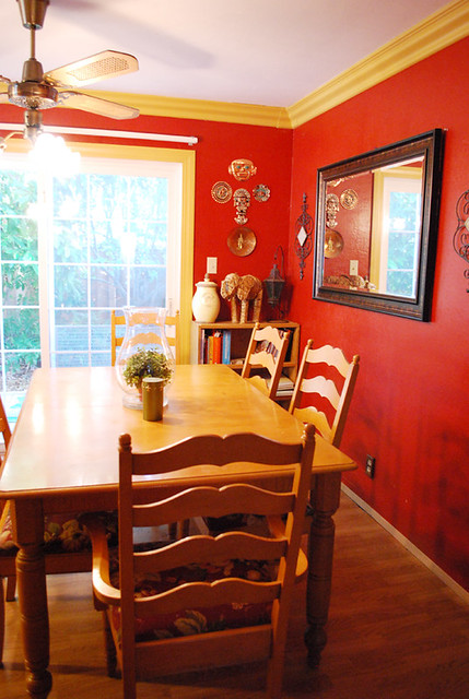
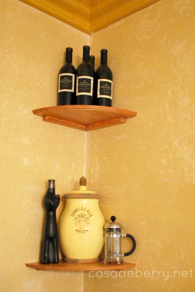
I love how our wrought iron “pops” with the creamy walls. Even though the color is lighter, the living room feels calmer without all that yellow. We are super happy with the results and if you ask Alex, he will grab your hand and show you the wall he helped paint ;D

A welcome change

This project has been in the back burner for a long time. I got an awesome Welcome sign from Leen the Graphics Queen and with holidays and birthdays and life, it’s just this past weekend that we finally put up the sign on our front door.

The door had a brass plaque on it that was put there two owners ago:

It is not our style to tell our guests to take their shoes off, considering we have two young kids and two cats so our carpets are hardly immaculate 😀

No project around here is complete without a drawing by my better half:

However, when we removed the plaque a couple of years ago we realized the wood behind it was a very different color from the rest of the door:

I knew I wouldn’t be able to match the color of the door — not only is the door over 20 years old, but it has obviously been weathered a lot, so my dear husband cut down a piece of spare wood for me:

I painted it black to match the door trim, sealed it, and added the decal:

The sign looks much better than the old brass plaque and has a much nicer message:

Our front door, looking so much nicer!

I am super happy with this little change, it’s something that every single person that comes to our door notices and although we would always tell them to ignore the previous sign, it still made people feel guilty and they’d take their shoes off. Now, it’s not an issue and our friends and family get a nice message instead – go check out Leen’s shop for this Welcome sign and many other goodies!

Dining Room & Kitchen Makeover – part 1

We loved our red walls.

Our red walls were so awesome.

There was just one teensy little problem. A complete lack of light coming into the kitchen and dining rooms.

See where the pots are hanging?

That’s where the big window used to be, looking out onto the backyard, with lots of natural light coming in. But a previous owner decided to add a room there – which is now the playroom/office. I know it looks like light is coming in to the kitchen, but the truth is, every single light has been turned on. The two kitchen lights, the dining room lights, the playroom lights, and I took the picture on a very sunny day (July of last year).

It didn’t help that the other source of natural light – the doors to the side yard, were shadowed by our pear and avocado trees, which we are NOT parting with.

Again, it looks bright and sunny here but every light was turned on.

Over the last few months we came to the realization that we could spend more years turning the lights on just to do dishes, because it really is that dark in the kitchen, or we could replace the red and help things along by installing some canned lighting.

We didn’t want to go back to the dreary off white that we found when we moved in:

We love warm, cozy colors – so off we went in search of a color we liked. It turns out there were two.

This is Valspar’s Cafe, a warm, creamy shade.

My husband wanted to try a sponging finish with a slightly darker color, so I chose Warm Buff, also by Valspar.

He did two walls so if we didn’t like the result, we could paint them over and start again. However, we both loved the finished look so we worked until late at night to get the painting done. We also made some minor changes and are still in the process of figuring out some final details, but we love the change. We went from this:

to this:

Some more views:


Already so much brighter and lighter, my dining room and kitchen no longer feel like such a cave! And I love that we can still have red accents around, but the neutral walls are open to so many colorways.

Now we are working on Canned lighting:


In fact, my husband is up in the attic as I type 😀

I hope your weekend is a wonderful one!
Weekend Bloggy ReadingPositively Splendid

Choosing paint colors

We’re re-painting our house this year – entryway, living room, hallway, dining room, kitchen, playroom/office. It’s been 8 1/2 years since we originally painted and it is time for a change.

This time we’re going with lighter walls – our current entryway, living room, and hallway color is a buttery yellow that is just a little too, well, yellow:

The playroom/office color is the original white, and the dining room/kitchen are a warm brick red:

I thought that making all the living areas the same color would unify everything and make it flow better. Or something. My husband has agreed, and the goal color now is cream. Which, as you know, can mean just about anything. These are some of the shades I like:

but who am I kidding here, I won’t know which one is The One until I slap some on the walls and see how I like it with the cabinets and furniture. Right now my favorite is Creamy White by Behr, so I’ll start with a sample of that and see where that gets us. I thought I loved Swiss Coffee and now I think it’s too greenish. Go figure.

I’ll post updates as to our color choice — I can’t wait to get started!!

Featured at Beneath my Heart

Holy painted tables, Batman! The wonderful Traci from Beneath My Heart featured my little green table as one of the best DIY in July projects! Yayness!

0730table9

You really couldn’t find a sweeter lady than Traci out there in blogland, and she’s crazy talented, too, so I am very psyched to have been featured on her blog.

I got a new project my husband and I (and my oldest) worked on these past few days, so I’ll tell you all about it soon – have a great Tuesday!

Pop of color

I don’t love the color on my house’s exterior. It’s a medium gray. With black trim. And an orange roof. We’ve lived here for 7 years, so sometime in the next 5 years we will probably paint the exterior.
I’d prefer a warmer gray, something like one of these:
In the meantime, I believe in being as happy as I can with my surroundings, as they are, so I decided to brighten up the front door. Please don’t mention the hideous mailbox and light fixture. They are evil. They are brassy. They will be destroyed, er, repainted.

I got an urn at a garage sale a couple of years ago and never really found a good place for it inside the house, what with kids and cats and dinosaurs all over the place. But I wondered if it could find a home right outside our door.

The color was very blah, though, so I decided to paint it a happy, sunny yellow:And I love it!!! The color is Bauhaus Gold by Krylon, it is a rich and saturated golden yellow, and I love both the contrast between the warm yellow and the gray and black, and the fact that it pops against the wood door.

That’s how our front door is looking these days, bright and cheerful and ready for summer!

Paris art

I’m always on the search for art depicting my favorite city in the world – Paris. Today I’m sharing these lovely works by artists that let us enjoy their art without spending beaucoup bucks.


This is one of four postcards in a set, made by TINYKITN. You could mail them, sure, but they would look so pretty framed in a grid, don’t you think? I would love something like this for a wall in my bedroom.

Now this one would belong in my kitchen/dining room – as would any of talented Lucille‘s other prints – not only do you get charming illustrations but many of them include a recipe as well. Gorgeous AND dangerous art!

I love how bright and cheerful Lynsey Hunter’s cards and prints are – she also has prints of different cars that I love.

Don’t you just want to sit on that chair and look out the window? Kitty on your lap, dog at your feet, what a great way to spend an afternoon. Shell Sherree‘s illustrations make me want to step into her art for a few hours.

Bon, c’est tout, mes amies, that’s all for now, my friends, I hope you have enjoyed these beautiful pieces of art with me!