The orange roof

We’ve started to think about painting the outside of our home. Probably will not happen this year, but it’s in the somewhat near future.

I would love to have a pale turquoise or aqua door:

Or maybe something like this charming little fence?

Then I remember . . .

I have an orange roof.

It doesn’t look very bright here. But it is. Bright enough that a turquoise door is out of the question.

So we’re going for a warm neutral palette. The current grey is very dingy so something lighter and brighter is a must.

Something like this would look nice:

This wall color would be as dark as I’d want to go:

I love my window boxes and like to have a variety of colors so a neutral background is best so it doesn’t all get too crazy. My husband likes the door in its natural color, so that will stay. We love the color we used in our living room, Valspar’s Cream in my Coffee, so perhaps something similar?

Do you have any painting projects coming up?

We’re not letting it mellow

When we moved into this house eight years ago, the living room was painted a dismal grayish-peach that made the space look small and drab. Wanting to lighten it up, I chose a buttery yellow for the walls. My husband Steve wanted a tan color for the trim so this is what we went with:

Both colors by Behr.

Eight years later, I’d had it with the yellow walls. So had my husband. We knew we wanted a warm neutral since those are the colors we gravitate to, our living room is filled with browns, creams, tans, reds, so to throw a grey or pure white wasn’t going to work. Steve picked Chamois Cloth by Behr, which looked lovely on the paint card, but it turned out to be pink. We don’t do pink. I do pink occasionally in my clothes, but pink walls are not us. Here are the painted and unpainted areas side by side after the Chamois Cloth snafu:

So it was my turn to get paint, and since it’s closer, I went to Lowe’s and got Valspar’s Cream in my Coffee:

Yes, that’s my youngest helping out, and you can see the difference between the yellow walls and the new color. Not a huge difference, just a subtle de-yellow-ing that left our walls looking brighter.

The color was a bit lighter than my husband had imagined, I think, he kept mentioning tans and that he wanted “color”, but he ended up liking it because a) our house is so dark that we need all the brightening up we can, and b) because it made for a peaceful, serene backdrop and accents in bright colors could then shine.

Speaking of our youngest, Alex, I have to say that one of the things I love the most about Steve is that he encourages the kids to jump in and help with whatever we’re doing, as long as it’s safe for them. Alex asked if he could help so out came a little roller he could handle and after covering up the floor, off he went to roll paint on the wall to his heart’s content.

Alex kept saying how happy he was to help — it was such a big deal for him to work alongside mommy and daddy! It was a big deal for us, too ๐Ÿ˜€

Another shot of the new color on the walls:

I love how our wrought iron “pops” with the creamy walls. Even though the color is lighter, the living room feels calmer without all that yellow. We are super happy with the results and if you ask Alex, he will grab your hand and show you the wall he helped paint ;D

A bedroom for Alex


While my oldest boy’s bedroom boasted a pirate theme and then got some superhero goodness as our boy’s tastes changed, our youngest, Alex, had a Mickey Mouse wallpaper border and a couple of Disney paintings. Meh.

Last week I went through Alex’s closet, which had become a dumping ground for old TVs and VCRs, and even his little bookcase was loaded with old shoes he’d outgrown.

Definitely not cool.

The project started when I decided to paint his dresser – Alex chose blue and when I showed him various pictures of blue items, he chose the rug in Emily Clark’s living room. I’m telling you, the kid has good taste. Inspired by the navy-and-off-white rug, I painted his dresser in Valspar’s Night Sky and Keystone.


Alex was so happy to see his dresser in the color he chose, he kept coming up to me as I painted the drawers and saying “that’s my blue!”.

I had some sailboat fabric that went very well with the grayish blue of the dresser, so I made a new cover for his body pillow:

Alex’s bookcase was loaded with some of his favorite books:

And his shelves were decluttered and only a few friends made it back on ๐Ÿ˜€ along with one of my all-time favorite pictures of my sweet boy.

Considering that Eric Carle books (and Bill Martin books illustrated by Eric Carle) are some of Alex’s favorites, I purchased a set of prints to liven up his walls. By the way, Alex also chose the color on his walls, Valspar’s Woodsmoke.

A new set of favorite books are the David books by David Shannon. These are hilarious stories about a little boy who gets in so much trouble but everything is well in the end. Alex read one at school and loved it, so I bought him two books from the series.

Here is Alex’s all-time favorite page in the No, David! book – David running nekkid down the street. Hmmm, must remind him of someone, huh?

The final touch, for all those creative moments, was a table I had, which I painted with chalkboard paint.

My boy was very happy with his room and as soon as he saw his David books asked me to read them with him, so we hopped in his bed, with his new pillows, and read them a few times.

I made just a few subtle changes to Alex’s room but now it reflects his preferences, which was the goal, to have a room that has things he likes and colors he chose. Also, the Eric Carle prints can be changed as Alexander’s tastes change, which I am sure they will.

Hope you enjoyed a peek into my sweetie’s room!

Insane Asylum sign

This past weekend, my husband made an awesome sign for Halloween.

Although, considering how crazy we tend to get around the holidays, I might be keeping that sign up for a while ๐Ÿ˜€

The backing is an old puzzle tray we had, pieces had gone missing long ago but the tray itself was perfect for this project. Steve added plain thumbtacks, then cut out the letters from foam – yes, by hand, I keep entering those Silhouette giveaways but haven’t won one yet – and then glued them to the frame. The first coat of spray was a metallic copper, then he did a wash with black paint so the pigment would settle into the crevices, and finally he added some greenish paint for a rusted, patina look.

I think he did such a great job!!! He has a lot more planned for our front yard but we wanted to share this bit for now.

So creepy!!!

\

shabby creek cottage

Dining Room & Kitchen Makeover – part 1

We loved our red walls.

Our red walls were so awesome.

There was just one teensy little problem. A complete lack of light coming into the kitchen and dining rooms.

See where the pots are hanging?

That’s where the big window used to be, looking out onto the backyard, with lots of natural light coming in. But a previous owner decided to add a room there – which is now the playroom/office. I know it looks like light is coming in to the kitchen, but the truth is, every single light has been turned on. The two kitchen lights, the dining room lights, the playroom lights, and I took the picture on a very sunny day (July of last year).

It didn’t help that the other source of natural light – the doors to the side yard, were shadowed by our pear and avocado trees, which we are NOT parting with.

Again, it looks bright and sunny here but every light was turned on.

Over the last few months we came to the realization that we could spend more years turning the lights on just to do dishes, because it really is that dark in the kitchen, or we could replace the red and help things along by installing some canned lighting.

We didn’t want to go back to the dreary off white that we found when we moved in:

We love warm, cozy colors – so off we went in search of a color we liked. It turns out there were two.

This is Valspar’s Cafe, a warm, creamy shade.

My husband wanted to try a sponging finish with a slightly darker color, so I chose Warm Buff, also by Valspar.

He did two walls so if we didn’t like the result, we could paint them over and start again. However, we both loved the finished look so we worked until late at night to get the painting done. We also made some minor changes and are still in the process of figuring out some final details, but we love the change. We went from this:

to this:

Some more views:


Already so much brighter and lighter, my dining room and kitchen no longer feel like such a cave! And I love that we can still have red accents around, but the neutral walls are open to so many colorways.

Now we are working on Canned lighting:


In fact, my husband is up in the attic as I type ๐Ÿ˜€

I hope your weekend is a wonderful one!
Weekend Bloggy ReadingPositively Splendid

Sassy Red Bookcase Makeover

As much as I am in love with my shades of turquoise and chartreuse, my love for burgundy will never fade. ย Although it does when I try to put it on my hair.

Recently I re-organized the entryway and ended up with a plain little bookcase with nowhere to go, so I decided to glam ‘er up and give her a place to live next to my desk.

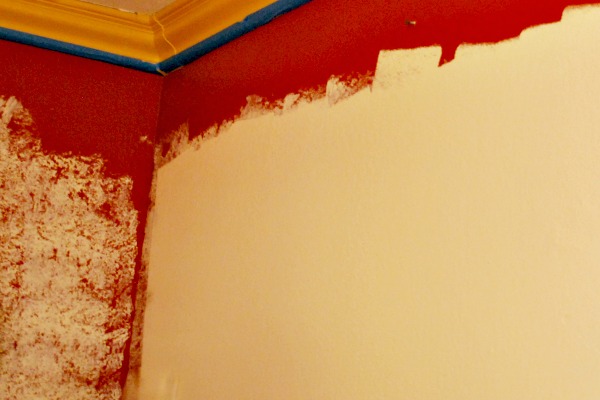
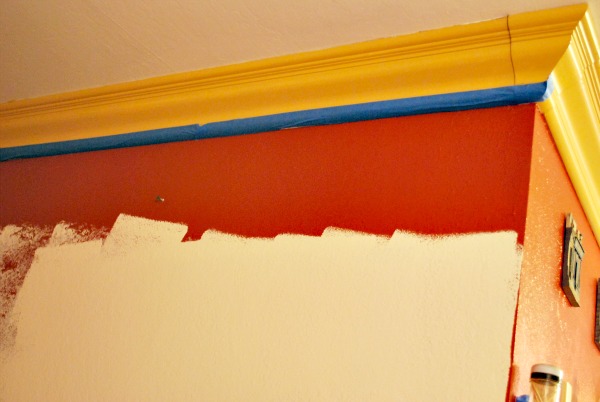
First I gave it a coat of primer, then two coats of Krylon’s Burgundy – geek moment: I was so giddy when I realized I used up the last of both that can of primer and the burgundy shade – ย am I the only one who loves finishing up cans of spray paint, because it means I can get more? – and finally, a coat of Rustoleum lacquer.


After waiting impatiently for it to fully dry, I started filling it up with items that I wanted near me, that had no place on my desk, and that made me happy.

Et voila!

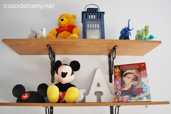
I am super happy with the result, it adds a lovely pop of color against the white walls of the office, and it has many items that make me smile.


I just received this beautiful mug for mother’s day, from my dear friend D, and believe me, it’s already getting some use. Seeing it there when I first go to my desk reminds me to just take a moment for myself before the craziness of the day begins. The green oval box hides some Splenda packets, and the Paris-papered oatmeal canister holds whatever current magazines I have.


The adorable mini chest of drawers was a gift from my dear friend A long, long ago, and the picture frames were gifts from my mom. The photo on the left is of us holding our month-old oldest, and the one on the right is our youngest’s hospital picture. I don’t think it looks anything like him but yes, I know it’s him because they took the pics in my hospital room ;D


The bottom shelf has a tray I decoupaged with more Paris-themed paper, one of my favorite votive holders (from the dollar bins at Michaels!), a little tray I made inspired by an item at Paper Source, my current inspiration books, and the most sought-after treasure in our household: PENS!!! I swear, I can’t keep them on my desk anymore because they get taken at an alarming rate ๐Ÿ˜€ so now they are sort of, maybe, semi-hidden. Who am I kidding, by the time this post is published there won’t be any pens left!

So that’s it, my latest re-vamp – I took this bookcase from drab to fab and didn’t spend a cent. But now, I must spend a penny, if you know what that means.

Have a wonderful weekend!

Choosing paint colors

We’re re-painting our house this year – entryway, living room, hallway, dining room, kitchen, playroom/office. It’s been 8 1/2 years since we originally painted and it is time for a change.

This time we’re going with lighter walls – our current entryway, living room, and hallway color is a buttery yellow that is just a little too, well, yellow:

The playroom/office color is the original white, and the dining room/kitchen are a warm brick red:

I thought that making all the living areas the same color would unify everything and make it flow better. Or something. My husband has agreed, and the goal color now is cream. Which, as you know, can mean just about anything. These are some of the shades I like:

but who am I kidding here, I won’t know which one is The One until I slap some on the walls and see how I like it with the cabinets and furniture. Right now my favorite is Creamy White by Behr, so I’ll start with a sample of that and see where that gets us. I thought I loved Swiss Coffee and now I think it’s too greenish. Go figure.

I’ll post updates as to our color choice — I can’t wait to get started!!

Stereo stand to craft tower

This old stereo stand had been languishing in the kids’ playroom — and my office — for several months:

I thought it had great potential for craft storage, and decided to give it a new look.

First came a coat of chocolate brown paint for the outside, a coat of Antique Gold for the shelves, and a Command hook for the side:

For the inside I chose my favorite peacock paper from Paper Source:

I gathered craft stuff that was scattered all over the house, and some random containers were given a new life. I didn’t want things matchy-matchy, and neither did I want to spend any money. Everything was done with items I already had.

Here you can see some of my paper crafting and sewing supplies:

Paper punches, threads and ribbons, and my blank card packs. I have so many, I really need to start using them!

On top, my pencils and markers, decorative scissors, various adhesives, and random bits and bobs, along with a tray I painted a while ago with my newest craft book:

Yes, it is The Martha’s Holiday Crafts book, and it is awesome. Some of the crafts are a little advanced to do with my boys, but I’m working on adapting a few.

So here it is, my sweet little craft station. I love that I transformed it without spending a cent and that it is now a useful piece instead of just storing old VHS movies and gathering dust.

I hope you enjoyed this makeover!

Featured At Serenity Now

It's OverflowingThursday Favorite ThingsWeekend Bloggy Reading The Shabby NestFurniture Feature FridaysPositively Splendid

Fall outdoor decor

I’m joining up the fall parteh at Sarah’s today with my BOO pumpkins. I saw this idea on pinterest and I decided to switch it up a bit.
1003boo4

First, I spray painted the pumpkins with Oil Rubbed Bronze. Then, since my oldest was helping me with this craft I made it a little easier for him by scribbling the letters on paper first.
1003boo

This made it easier for him to “trace” with the silver thumbtacks:
1003boo1

Once the letter was done, I held the thumbtacks in place and gently pulled off the paper.
1003boo2

My stylist-in-training decided that my Martha Stewart web ribbon would be perfect on the urn I painted a few months ago:
1003boo5

Pretty simple and easy, and I love how the thumbtacks reflect light so even if it’s getting dark you can see the pumpkins with their BOO ๐Ÿ˜€

Hope you enjoyed this outdoor craft!

Designer GardenThe Shabby Nest Weekend Bloggy ReadingChic on a Shoestring DecoratingmonogramWeekend Bloggy ReadingTip Junkie handmade projects