Master bedroom

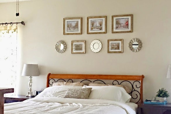
A wise friend advised me to focus on the master bedroom, to create a sanctuary there even if the rest of the house was not finished. For the most part we did that, because having a place for the whole family to gather was at the top of our list, so our living room did get top priority. Today I’m sharing our master bedroom as it is now. I still want to have a little sitting area, but for the most part, it is functional, and after a few things we added this past weekend, I think it’s beautiful.

I wanted warm, soothing neutrals, a bit of glam, a bit of Paris (of course), and I definitely wanted to make good use of things we had in our California house.

The main purchase here was the bed. We wanted a king-sized bed (Eastern king, not California king), and Steve wanted a sleigh frame, so we looked and looked, and found the bed at Wayfair.

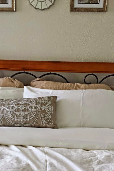
We had the white duvet cover, got white sheet sets from IKEA and WalMart, and the beaded pillow is from the clearance aisle at Pier 1. Our Stearns and Foster mattress is absolutely heavenly to sleep on, and was purchased from Ashley Furniture in nearby Brookfield.

We bought some prints from street vendors when we were in Paris last November, and I’ve held on to them until I figured out what I wanted to do with them. We considered putting them in the living room, dining room, but in the end I liked the idea of having them in our bedroom.

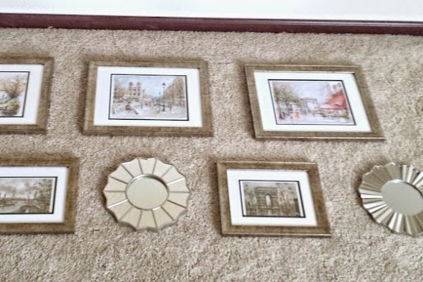
The frames are from the “value” section at Michaels, and the set of mirrors are from Kohl’s, but I’ve seen similar at Target.

Steve did a great job putting them up and we both love how they look up there.

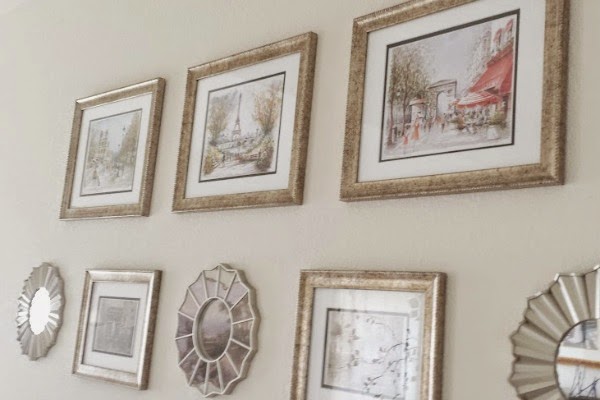
The neutral frames let the color in the prints pop and this little gallery is a sweet reminder of our trip.

The nightstands are IKEA Expedit pieces we brought from California, and the lamps and shades are from WalMart.

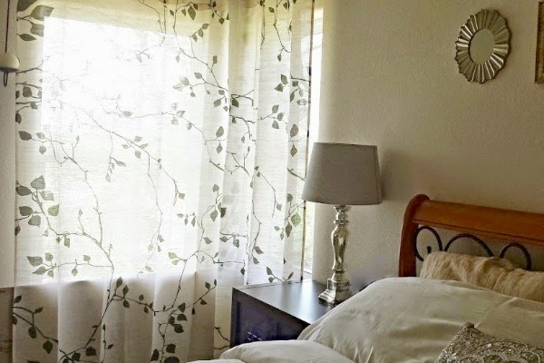
I love these curtains.

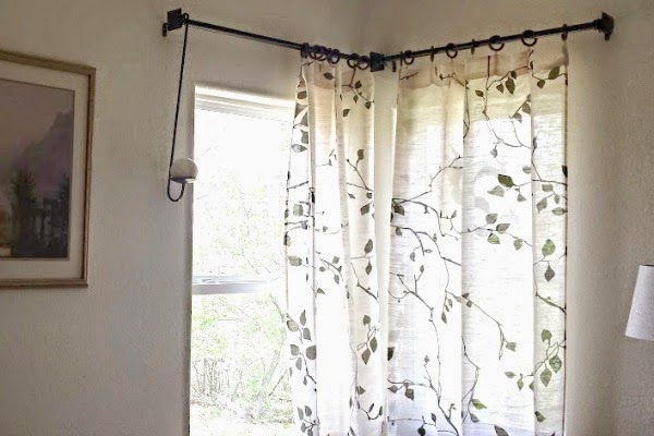
They’re from World Market and the moment I saw them I knew that I wanted them. They’re neutral and warm, and I liked that they give us privacy but are not completely blocking the light. Don’t worry, we don’t light those candles when the curtains are closed 😀

The painting to the left was brought from our California bedroom.

We also have our two dressers facing the bed, as well as the trunk that is a family heirloom. We’re really happy how our bedroom is coming along, it is a soothing, comfortable space we both love.

The orange roof

We’ve started to think about painting the outside of our home. Probably will not happen this year, but it’s in the somewhat near future.

I would love to have a pale turquoise or aqua door:

Or maybe something like this charming little fence?

Then I remember . . .

I have an orange roof.

It doesn’t look very bright here. But it is. Bright enough that a turquoise door is out of the question.

So we’re going for a warm neutral palette. The current grey is very dingy so something lighter and brighter is a must.

Something like this would look nice:

This wall color would be as dark as I’d want to go:

I love my window boxes and like to have a variety of colors so a neutral background is best so it doesn’t all get too crazy. My husband likes the door in its natural color, so that will stay. We love the color we used in our living room, Valspar’s Cream in my Coffee, so perhaps something similar?

Do you have any painting projects coming up?

The Chair Affair

A few months ago we got rid of the red walls in our dining room/kitchen — this time, we got rid of the red fabric on our dining room chairs.

It’s not the we don’t like red. Instead, now we keep an eye out for red accents for our dining and cooking areas. You see, beforehand, a red vase or red flowers either disappeared against the red walls, or clashed completely. Now, we have a neutral background for red, or olive green, or whatever other color we choose to accent the room with.

In the case of the chairs, it was also a case of eager kitties sharpening their claws, and our poor chairs were looking so much worse for wear. Happily, a new fabric gave us a clean, fresh slate AND brightened up the look of our dining room:

I like that it has a cream background and a bold print and still keeps it all neutral. I could put a red tablecloth on the table, or a green one, or warm yellow, and it would not compete or clash. LOVE that.

Now that we have recovered from the plague (knock on wood!!!) we hope to have a fun weekend and wish you a super happy and healthy one as well!

We’re not letting it mellow

When we moved into this house eight years ago, the living room was painted a dismal grayish-peach that made the space look small and drab. Wanting to lighten it up, I chose a buttery yellow for the walls. My husband Steve wanted a tan color for the trim so this is what we went with:

Both colors by Behr.

Eight years later, I’d had it with the yellow walls. So had my husband. We knew we wanted a warm neutral since those are the colors we gravitate to, our living room is filled with browns, creams, tans, reds, so to throw a grey or pure white wasn’t going to work. Steve picked Chamois Cloth by Behr, which looked lovely on the paint card, but it turned out to be pink. We don’t do pink. I do pink occasionally in my clothes, but pink walls are not us. Here are the painted and unpainted areas side by side after the Chamois Cloth snafu:

So it was my turn to get paint, and since it’s closer, I went to Lowe’s and got Valspar’s Cream in my Coffee:

Yes, that’s my youngest helping out, and you can see the difference between the yellow walls and the new color. Not a huge difference, just a subtle de-yellow-ing that left our walls looking brighter.

The color was a bit lighter than my husband had imagined, I think, he kept mentioning tans and that he wanted “color”, but he ended up liking it because a) our house is so dark that we need all the brightening up we can, and b) because it made for a peaceful, serene backdrop and accents in bright colors could then shine.

Speaking of our youngest, Alex, I have to say that one of the things I love the most about Steve is that he encourages the kids to jump in and help with whatever we’re doing, as long as it’s safe for them. Alex asked if he could help so out came a little roller he could handle and after covering up the floor, off he went to roll paint on the wall to his heart’s content.

Alex kept saying how happy he was to help — it was such a big deal for him to work alongside mommy and daddy! It was a big deal for us, too 😀

Another shot of the new color on the walls:

I love how our wrought iron “pops” with the creamy walls. Even though the color is lighter, the living room feels calmer without all that yellow. We are super happy with the results and if you ask Alex, he will grab your hand and show you the wall he helped paint ;D

Fashion Friday: Fall Cravings

I am loving all the rich colors in stores everywhere – be it home decor or apparel, deep greens, browns, burgundies, and golds are everywhere. Let me share a few pretties that have caught my eye recently:

1. Wool blend coat from Old Navy

2. Cotton peplum shell by LOFT

3. Polka dot top by Merona @ Target

4. Rose bouquet print skirt by LOFT

5. Leopard print cropped pant by Merona @ Target

6. Hooded anorak from Old Navy

7. Celtic riding boot by Etienne Aigner at DSW

8. Wedge pump by Adrienne Vittadini at DSW

9. Stargazer bangles at Nordstrom

10. Lost in Paradise Earrings at Francesca’s Collections

11. Rustic Wear Scarf at Francesca’s Collections

12. Bellini Lip & Eye Palette by Bobbi Brown

What has caught your eye from among the fall season offerings out there?

Dining Room & Kitchen Makeover – part 1

We loved our red walls.

Our red walls were so awesome.

There was just one teensy little problem. A complete lack of light coming into the kitchen and dining rooms.

See where the pots are hanging?

That’s where the big window used to be, looking out onto the backyard, with lots of natural light coming in. But a previous owner decided to add a room there – which is now the playroom/office. I know it looks like light is coming in to the kitchen, but the truth is, every single light has been turned on. The two kitchen lights, the dining room lights, the playroom lights, and I took the picture on a very sunny day (July of last year).

It didn’t help that the other source of natural light – the doors to the side yard, were shadowed by our pear and avocado trees, which we are NOT parting with.

Again, it looks bright and sunny here but every light was turned on.

Over the last few months we came to the realization that we could spend more years turning the lights on just to do dishes, because it really is that dark in the kitchen, or we could replace the red and help things along by installing some canned lighting.

We didn’t want to go back to the dreary off white that we found when we moved in:

We love warm, cozy colors – so off we went in search of a color we liked. It turns out there were two.

This is Valspar’s Cafe, a warm, creamy shade.

My husband wanted to try a sponging finish with a slightly darker color, so I chose Warm Buff, also by Valspar.

He did two walls so if we didn’t like the result, we could paint them over and start again. However, we both loved the finished look so we worked until late at night to get the painting done. We also made some minor changes and are still in the process of figuring out some final details, but we love the change. We went from this:

to this:

Some more views:


Already so much brighter and lighter, my dining room and kitchen no longer feel like such a cave! And I love that we can still have red accents around, but the neutral walls are open to so many colorways.

Now we are working on Canned lighting:


In fact, my husband is up in the attic as I type 😀

I hope your weekend is a wonderful one!
Weekend Bloggy ReadingPositively Splendid

Fashion Friday: Family Pics

As the days of Thanksgiving and Christmas approach, there is another event that we honor every year – Family Picture Day.

This year I am considering a very neutral theme:

family photos

Special friends such as my oldest’s Soft Elephant and my youngest’s Zebra & Rabbit are always welcome – they are part of the family ;D

Do you take annual pics?

A little corner of my world

We recently got new nightstands – we decided on the Expedit from IKEA in the walnut finish and have been really happy with them. Our boys inherited our old nightstands. I’ve been on a turquoise kick and I was very happy to receive my LOVE print from Made by Girl this week. I love the pop of color on our neutral walls:
My little corner is full of things I love: yellow roses from the plant my husband got me, pics of him and our boys, and wrought iron/fleur de lis decor. I also got some pillowcases in chocolate brown/turquoise to use as accents, since most of our bedding is in neutral colors. The vase is not as dark blue as it looks in the photo, it is (you guessed it) turquoise and it is from IKEA.

Have a wonderful weekend, everyone!

Pillow Talk

I recently ordered some pretty fabric because I was jonesing to make some new pillow covers. I had made some red/green/tan striped ones but my husband hated them with a passion, so I figured, hey, I get to make new pillow covers!

I went neutral this time and also ordered some pretty trim to go with my fabrics
I love the color combination against our burgundy sofa.

Next time, though, I would go for a neutral sofa, something like a light brown, and these covers would still go nicely.
The ribbon satisfies my fleur-de-lis fetish 😀

The quatrefoil design on this fabric is so pretty, detailed enough for not fussy.

The trim has a very nice sheen to it and frames both fabrics well.
I have a few more covers to make, I really need a 25- or 26-hour day!

Linking this up!
Weekend Bloggy Reading
linkpartyIron Violet Designs

and at Show and Share and Scentsy Day!

Warm neutrality

I love looking through people’s homes, mostly when their sense of color is different from mine. I love cottage chic dining rooms, crisp and clean bedrooms, soothing blue and white living rooms. I love seeing how people put their visions together and seeing how the details are more often what pull it all into a cohesive look.

For me, it’s all about warmth, coziness, and the way I see that is through color. Our home palette is full of yellows, both butter and butternut colored, warm reds, honey-toned wood and a trim color in our kitchen/dining room called Peanut Butter 😀

Here are some more warm neutrals inspiration pics – all from Martha Stewart: